


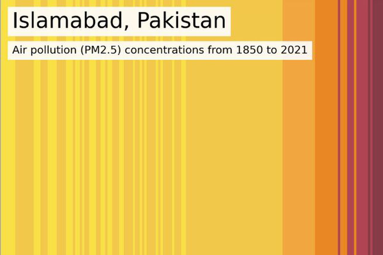
A visualization of PM2.5 air pollution concentrations in Islamabad, Pakistan, from 1850 to 2021. | Image: Air Quality Stripes
A new tool shows how much air quality has changed since the Industrial Revolution in cities across the world. It generates a single image made up of different colored stripes representing pollution each year in each major city.
You can see stark contrasts from place to place, showing how much work is left to do to clean up pollution and also how well those efforts can pay off in the long run. Air pollution has fallen sharply in wealthy Western nations but is still a serious health risk in many places around the world.
“Air pollution is often called the ‘invisible killer,’ but these images make the invisible visible,” Kirsty Pringle, a codirector of the project who is based at the University of…